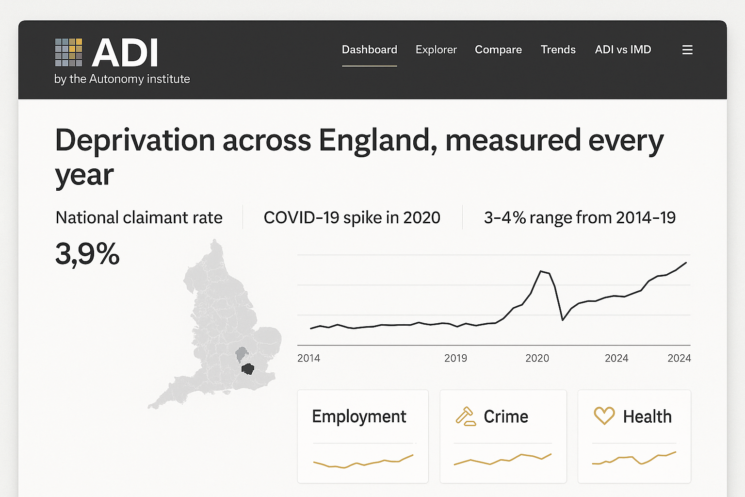
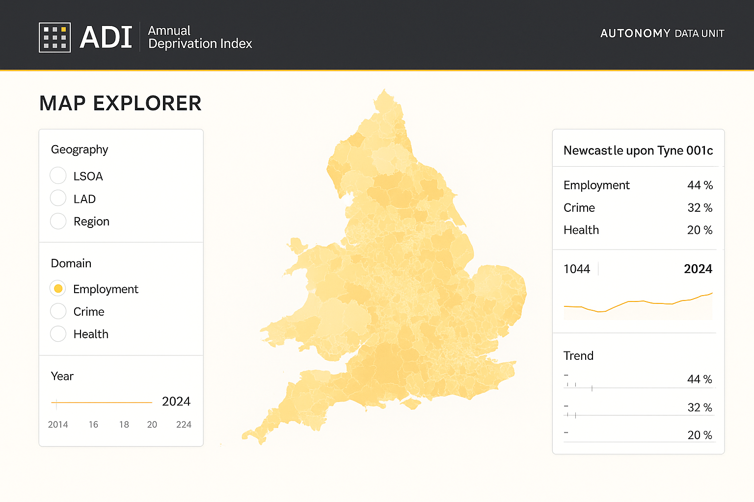
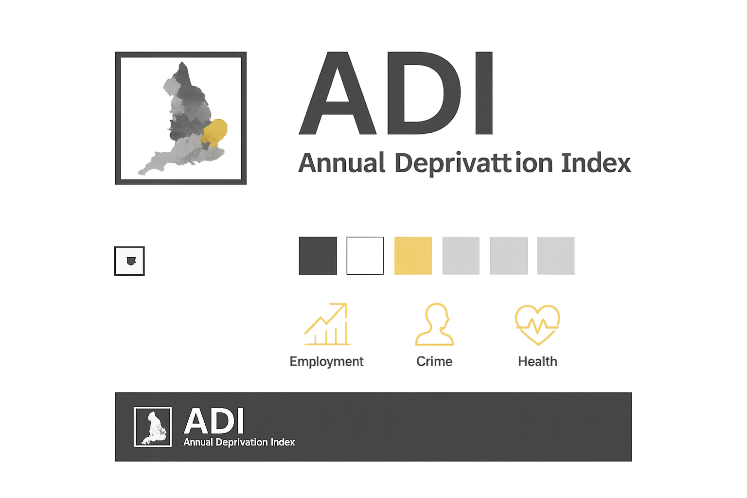
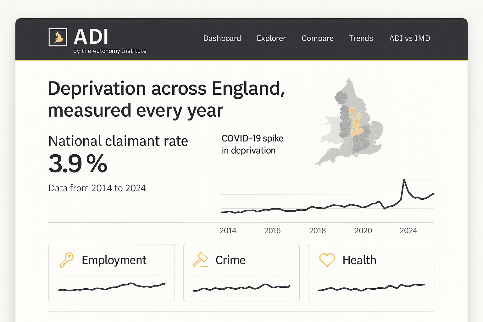
Three candidate directions, all inside the Autonomy / ADU family (charcoal + white + golden, IBM Plex Sans/Serif, square-outline mark, golden hairline rule — the same system as the sibling ASPECTT app). They differ mainly in the logo mark motif and chart treatment. Each is carried through a mark sheet, a dashboard home, and the map explorer so you can judge it applied. These are raster ideation only — text is placeholder/garbled, that's expected; judge composition, motif, colour and feel. Click any image to open it full-resolution (1536×1024).
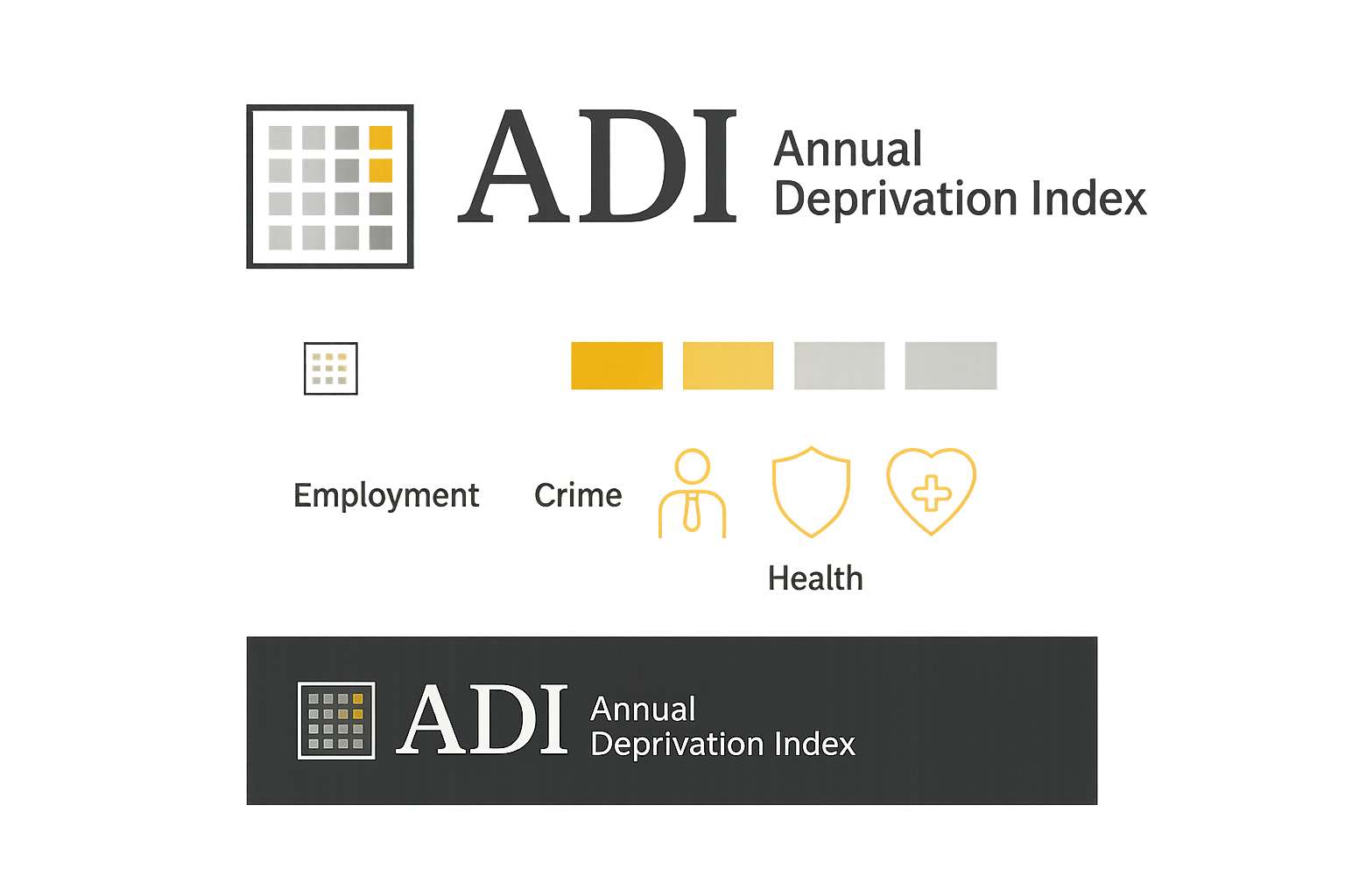
AChoropleth grid — recommended
Mark = a 4×4 grid of graded squares (neighbourhoods / LSOAs), two tipped golden.
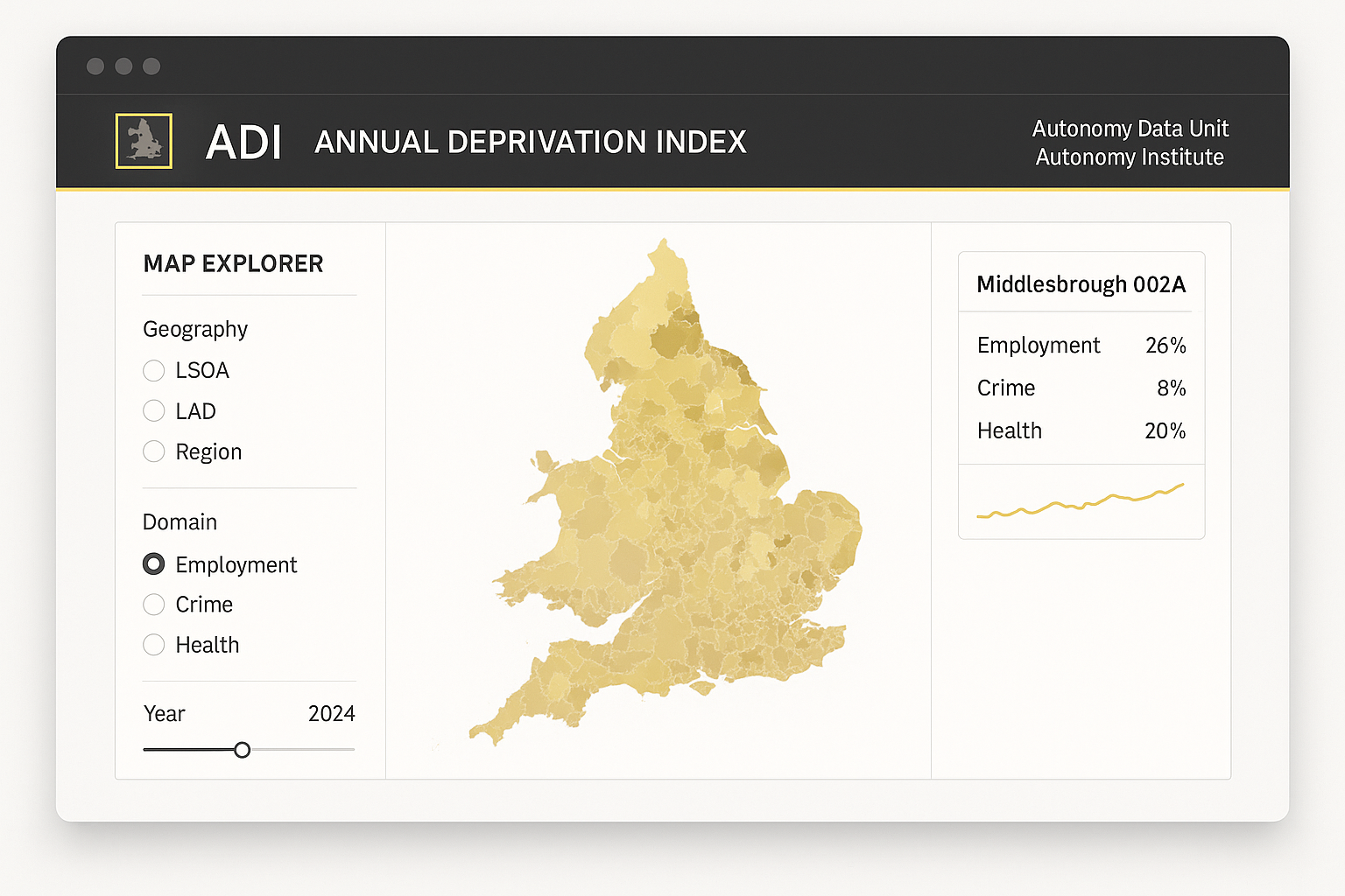
BEngland in a square
Mark = a minimal England silhouette with a coarse choropleth fill.
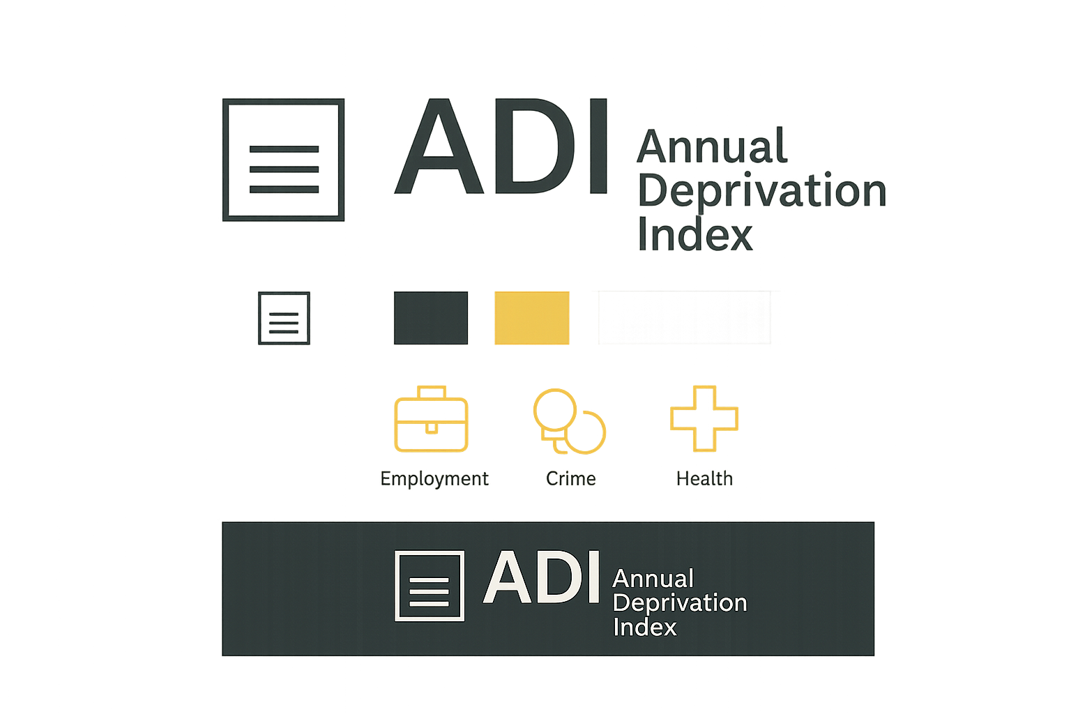
CIndex strata
Mark = three stacked horizontal bars (employment / crime / health), one golden.